Make Every Interaction Feel Effortless
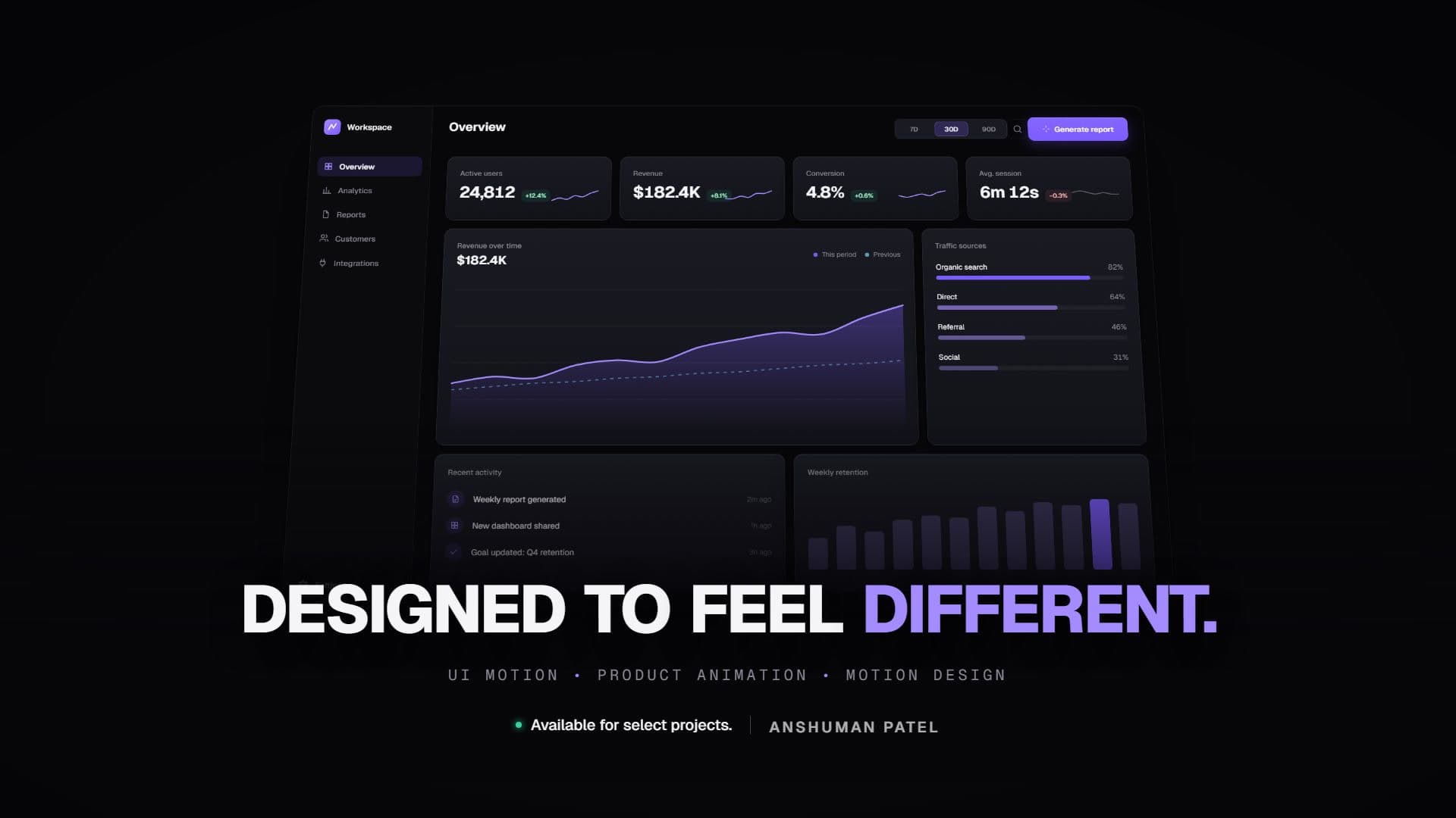
Designed to feel different.
- Context
- Self-initiated UI motion reel
- Year
- 2026
- Format
- 16:9 · 0:27
- Discipline
- Motion Graphics, SaaS & Product Videos
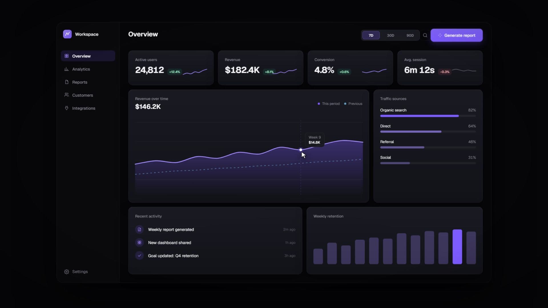
Final film · sound on · press F for fullscreen
01Overview
A reel that shows how motion makes software feel considered — micro-interactions first, spectacle second.
02Visual concept
One fictional workspace dashboard, explored the way a user would: hover, press, wait, get notified.
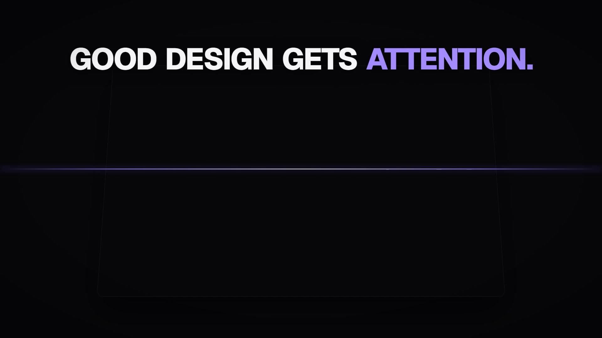
03Editing & storytelling
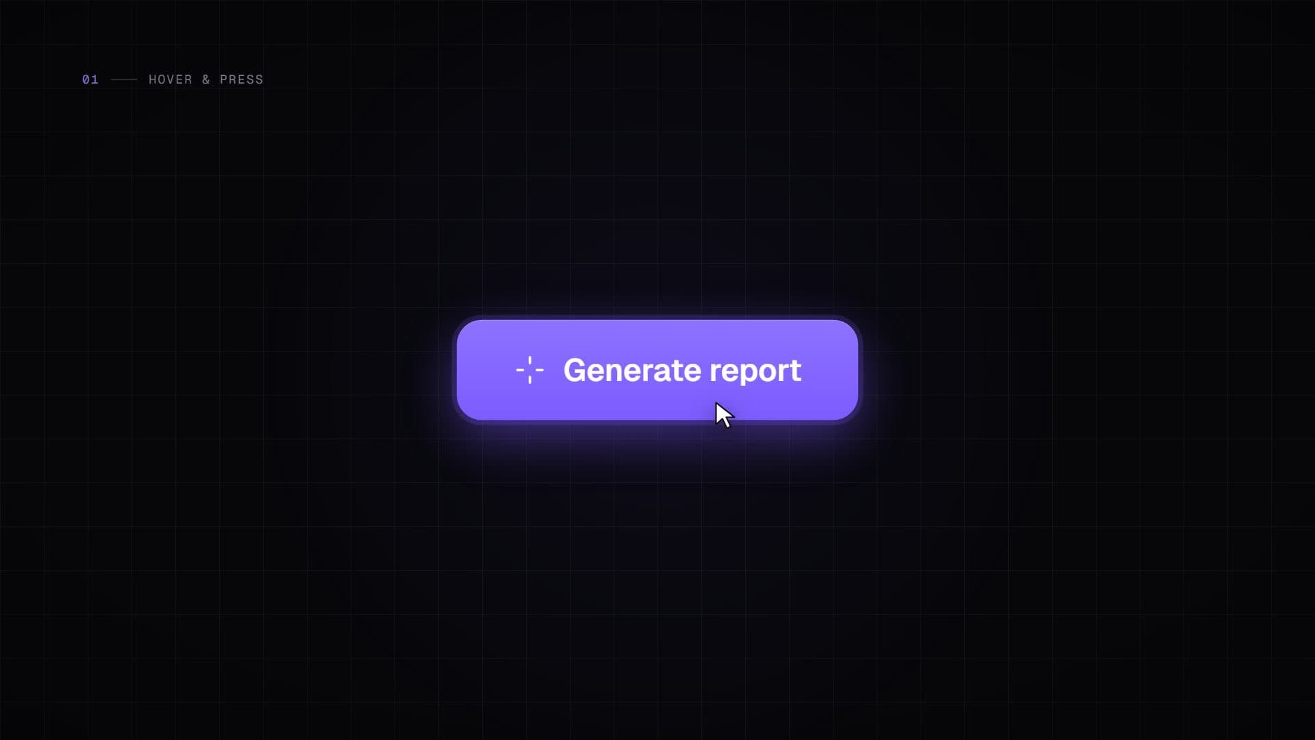
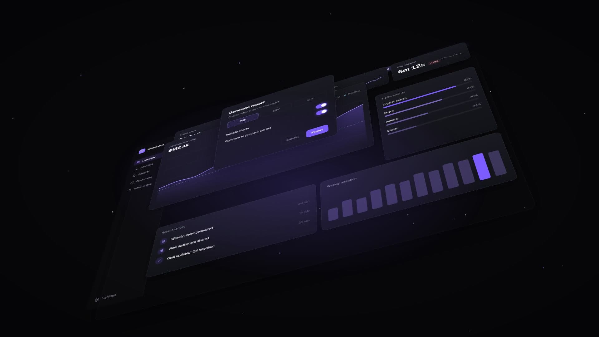
Short chapters, each introduced by a numbered label — hover & press, notify — then a 3D pull-back reveals the whole product.
04Motion & typography
Spring-based button states, live chart draws, toast notifications and a perspective camera move across the UI.
05Color grading
Near-black surfaces, soft violet accents and restrained glow — premium without noise.
- Role & contribution
- UI design
- Product animation
- Motion design
Next project →
Websites That Work
Motion Graphics · Brand Films · SaaS & Product Videos